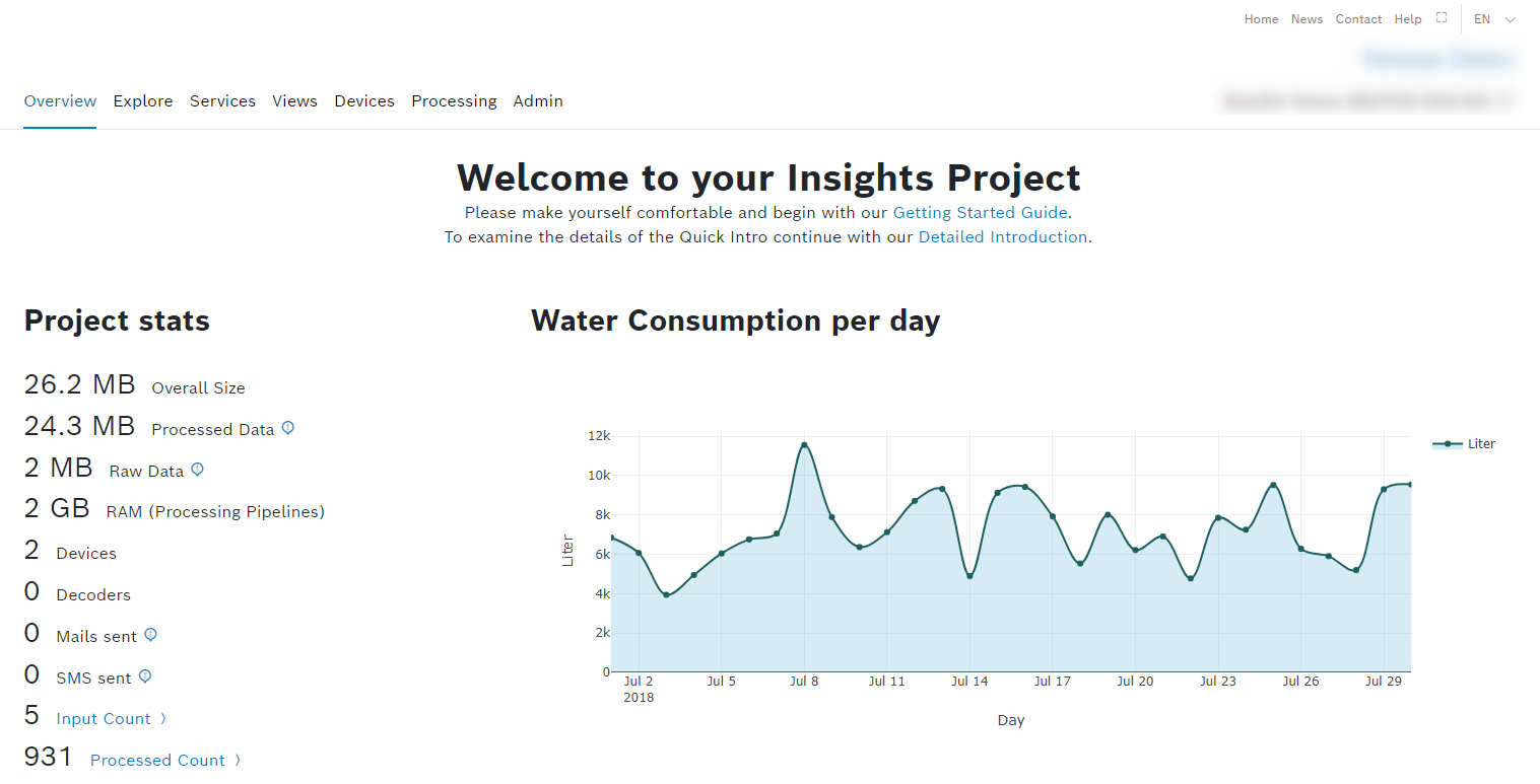
The next step is to visualize your data. Therefore, we will create a bar chart widget onto your Overview page that shows the data for the month of July. The Overview menu item also acts as your dashboard where you can monitor all your data.
The Project Stats widget, for example, shows the following information:
- the file size of your current project (Project size)
- the number of individual data sets the project currently contains (Input count)
- the number of data sets that have already been processed (Processed count)
The dashboard offers a number of configurable widgets that enable you to display the data you select in graphical form. The widgets show only the data you have selected using your query template.
Proceed as follows
- Open the Overview menu item.
- Click the Add widget button to create your first widget.
Under Charts, select the Bar widget.
This widget renders data into a bar chart. In our use case, this would be the best option for presentation.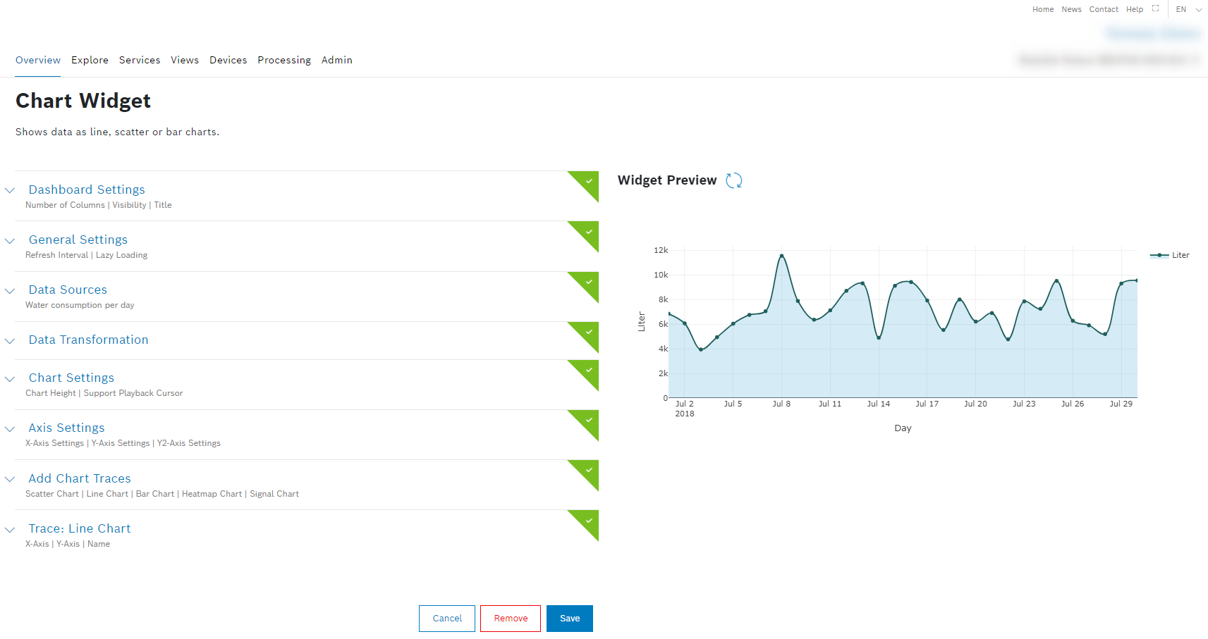
- Open the Dashboard Settings pane to set how the widget is displayed in the dashboard.
- In the Title field, enter a title for the widget, e.g. Water consumption as per date_range Unit1.
- Open the Data Sources pane to configure the data source for the widget.
- Click the + Add Source button to add a data source.
- In the drop-down list, select Query Template.
- In the Query Template drop-down list, select the query template you just created in the Creating the query template chapter.
- Click the Save Data Source button.
- Scroll down to the Trace: Bar Chart pane to select the parameters for the axes.
- In the X-Axis Data Path drop-down list, select Day for the x-axis.
- In the Y-Axis Data Path drop-down list, select Liter for the y-axis.
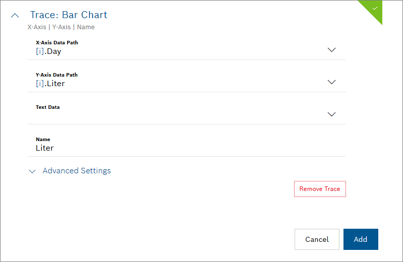
- To save and add the widget to your dashboard, click the Add button.
→ The widget is added to the Overview.