Calendar widget
Using the Calendar widget, you can create bookings for devices. You can also create bookings for appointments that do not have to be linked to devices. The calendar can be displayed by month, week, or day.
Use Cases:
Repairs
Maintenance
Scheduled tests
Flexible tests
The calendar widget offers three display modes:
Calendar mode
Timeline mode
Table mode
Example

Proceed as follows
Start with the Add widget action, as described in Adding widgets.
Select the Calendar widget in the widget list.
→ The widget configuration page is displayed.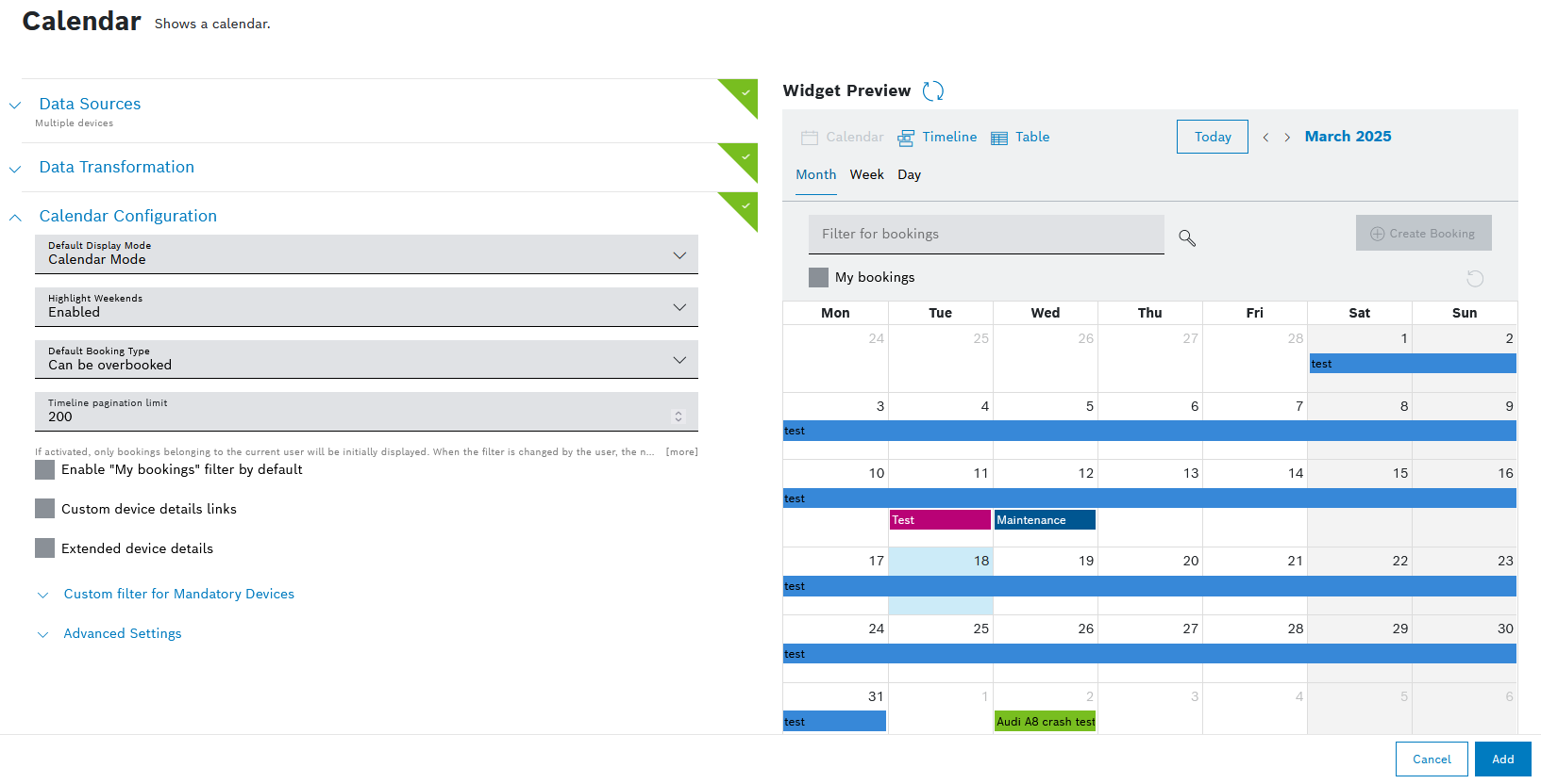
Configure the settings as described below.
Click the Add button.
→ The widget is added to the dashboard.
Dashboard Settings
Open the Dashboard Settings pane to set how the widget is displayed in the dashboard.
In the Size drop-down list, decide how much space the widget should take in the form of columns.
In the Title field, enter a title for the widget.
For a dynamic title, you can add placeholders with the ${...} notation. Possible placeholder sources are filterParams (if a filter widget exists on the dashboard, e.g. ${filterParams.paramName}) or data from the data source (if source is specified, e.g. ${[0].payload.value}), insights (user context), dashboardName or widgetId.
In the Visibility drop-down, set whether the widget should be visible or hidden. You can also define for which specific roles the widget will be shown or not. This setting allows you to customize dashboards for specific user groups that have a certain role.
Visible: The widget is visible for all (default)
Visible for roles: The widget is visible if any of the selected roles matches one of the user's project role
Hidden: The widget is hidden for all
Hidden for roles: The widget is hidden if any of the selected roles matches one of the user's project roleIn the Layout behavior drop-down list, decide how the size of the widget should be adapted in the dashboard.
In the Collapsible widget content field, select one of the following options:
Yes (collapsed on initial load): The widget will be collapsed on the initial load, however, the latest state (expanded or collapsed) will be saved in the local storage.
Yes (expanded on initial load): The widget will be expanded on the initial load, however, the latest state (expanded or collapsed) will be saved in the local storage.
No: The widget will not be collapsible.
The Collapsible widget content option is available only for dashboards with the grid-based layout.
If this option is enabled, the widget content can be collapsed and expanded on demand by the user to save space or hide irrelevant content based on personal interest. Keep in mind that a widget that is currently collapsed on a dashboard cannot be exported.
When the rearranging option is enabled, any collapsed widgets will be automatically expanded. On the compact layout these auto-expanded widgets will be automatically rearranged, whereas on the free-floating grid, they will remain where they are.
General Settings
Open the General Settings pane to configure some general aspects for the widget.
In the Lazy Loading drop-down list, select whether you want to enable or disable lazy loading.
Lazy loading is enabled by default. That way, widgets are only loaded when they are visible on screen. This prevents slower loading of the dashboard and performance issues.
Data Sources
Open the Data Sources pane to configure the display of devices.
When connected to the Filter widget:
In the Pagination Limit field, enter the number of devices to be displayed.
In the Sort field, enter a parameter to sort the displayed devices.
In the Filter field, enter a custom Things Filter to filter your devices.
When disconnected from the Filter widget:
In the Select Device Types drop-down list, select a device type.
In the Advanced Settings, you can specify more values as indicated in the Multiple Devices section below.
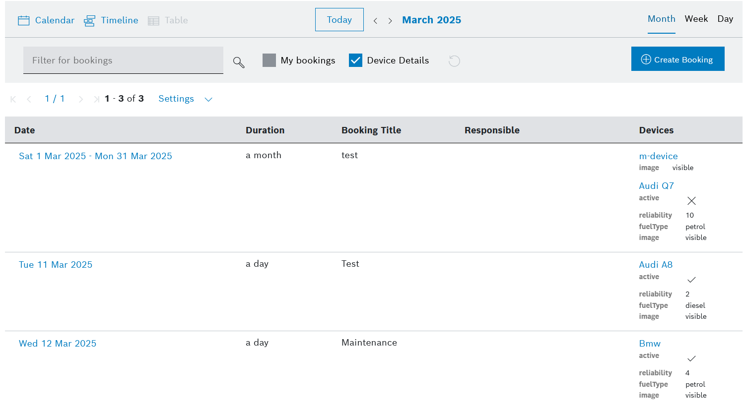
Multiple Devices
In the Select Device Types drop-down list, select a device type.
Click the Advanced Settings button to narrow down the output.
In the Start field, enter a value to specify the device to start with.
Example: If you select 3, the first two devices are skipped.
In the Limit field, enter a value to specify the last device.
The maximum is 200 devices.
In the Fields field, enter the fields whose information shall be retrieved from Device Management.
In the Sort field, enter a field configured in Device Management according to which the data shall be sorted.
In the Namespaces field, add namespaces separated by a comma.
In the Filter field, add a filter to narrow down the search results. Placeholders are also supported.
Click the Source data preview icon
 to open a preview.
Click the Update Source button.
Data Transformation
With the data transformation activated, you can select entries from arrays in arrays or a specific range of arrays.
Also refer to the JMESPath documentation.
Open the Data Transformation pane to activate the data transformation to JMES.
Activate the toggle switch.
In the Filter field, add a string to filter the data, e.g. [0] to display only the first item or [?contains(thingId,'yourThingName')] to filter by contains in the thingId property.
Click the Transformed data preview icon
 to open a preview.
→ The data transformation is activated for the widget.
If you selected more than one data source, the Data Aggregator pane is displayed.
Activate the toggle switch.
In the Data Aggregator drop-down list, select an aggregation method with which each entry of the same index is merged into one result.
Activate the Merge Properties checkbox to merge the properties of the index.
In the Filter field, add a string to filter the data, e.g. [0] to display only the first item or [?contains(thingId,'yourThingName')] to filter by contains in the thingId property.
Click the Transformed data preview icon
to open a preview.
→ The data transformation is activated for the widget.
Calendar Configuration
Open the Calendar Configuration pane to set how the widget is displayed by default.
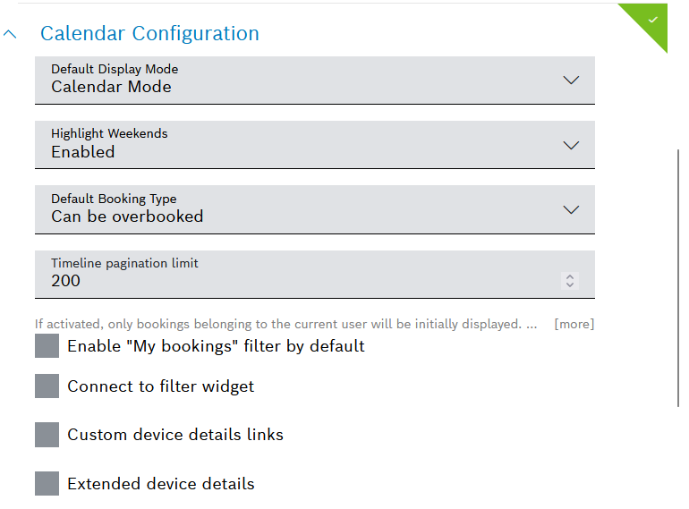
In the Default Display Mode drop-down list, select one of the following display modes to be set as default:
Calendar Mode: Displays the calendar as usual.
Timeline Mode: Displays the resources and their bookings in the calendar.
Table Mode: Displays the bookings in a table.
In the Highlight Weekends drop-down list, select whether you want the weekends to be represented in a different color than the working days.
The default value is Enabled, meaning that the weekend will have gray background coloring in contrast to the white working days.
In the Default Booking Status drop-down list, select the default status of bookings.
Can be overbooked: The selected device can be booked multiple times at the same time range.
Non-overbookable: The selected device cannot be booked multiple times at the defined time range.
The time range can collide with a booking with the booking status Can be overbooked. The owner of the Can be overbooked booking receives a notification of the new booking with this status.Blocked: The device and the time range cannot be booked again. A booking with the booking status Blocked has the highest priority. Owners of Can be overbooked and Non-overbookable bookings with that same device within the same time range receive a notification on the new booking with the Blocked status informing about the non-availability of the device in this time range.
In the Timeline pagination limit drop-down list, define the number of resources to be displayed per page in the widget's Timeline display mode. The maximum number of entries per page is 200, which is also the default value.
The value which you set here will be displayed at the top of the Settings drop down list. There you can change the resources per page at any time, and this value will be saved in your local storage.
Activate the Enable "My Bookings" filter by default checkbox to only show the bookings of the currently logged-in user upon opening the calendar.
Activate the Connect to filter widget checkbox to connect the Calendar widget with the Filter Panel widget.
This checkbox is only available if the Filter Panel widget has been configured on the dashboard.
Activate the Custom device details links checkbox to define a custom link that leads to the device details, and/or to change the order in which the device types will appear as resource groups in the widget's Timeline display mode.
→ The device details page is configured as default.To change the link of the Default device details page, define a default URL with query parameters that will be displayed for all devices.
To add a custom URL for a specific device type, click the Add Custom Device Type URL drop-down list and select a device type.
In the Custom device details page field, define the custom URL with query parameters.
You could also add a link to a view that shows the details of the device.
Repeat the steps if you want to add a custom link for another device type.
The so selected device types will appear, in their order of selection, on the top of the list of resources in the widget's Timeline display mode.
You can keep this custom order or change it using drag and drop.
→ The custom order is shown in the preview of the Timeline display mode, on the right of the configuration editor.
→ When custom order is applied for only some of the existing device types, the rest of them will be added to the end of the list in alphabetical order.
→ If no custom order is applied at all, alphabetical order applies by default.
To change the default alphabetical order in which the device types are listed as resource groups in the widget's Timeline display mode, without applying a custom URL:
Click the Add Custom Device Type URL drop-down list and select a device type.
Repeat this for every device type for which you want to apply custom order.
→ The so selected device types will appear on the top of the list in their order of selection. Drag and drop the entries to change this custom order.
→ The rest of the device types will be added to the end of the list in alphabetical order.
→ A preview of the custom order is available on the right of the configuration editor, in Timeline display mode.
Activate the Extended device details checkbox to display device properties in the calendar booking.
In the Type drop-down list, select a device type.
In the Add properties drop-down list, select the device property.
Add a maximum of five device properties per device type to ensure a good user experience when displaying the calendar booking.
→ The device type and the corresponding device properties are added grouped by device type.
To change the order of the device properties, click the move icon and drag and drop the device property to the desired location.
To delete a device property, click the delete icon in the line of the desired device property.
If you have configured device types to be mandatory for calendar bookings, you can set a custom filter for these devices.
Open the Custom filter for Mandatory Devices pane to configure the filter.
→ The device types set to mandatory are displayed.Add a filter using query parameters to the field, such as like(features/general/properties/name,"*${filterParams.test}*").
Open the Advanced Settings drop-down menu to define a default filter for the devices that shall be displayed for booking.
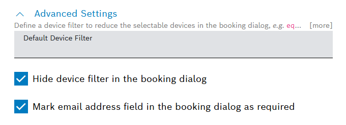
In the Default Device Filter field, enter a default device filter, such as eq(attributes/type,”car”).
→ The filter is displayed in the Booking dialog.Activate the Hide device filter in the booking dialog checkbox to hide the Advanced Settings section in the Booking dialog.
Use this checkbox if the filter should neither be accessed nor edited.
Activate the Mark email address field in the booking dialog as required checkbox to require users to add confirmation email addresses in the dialog
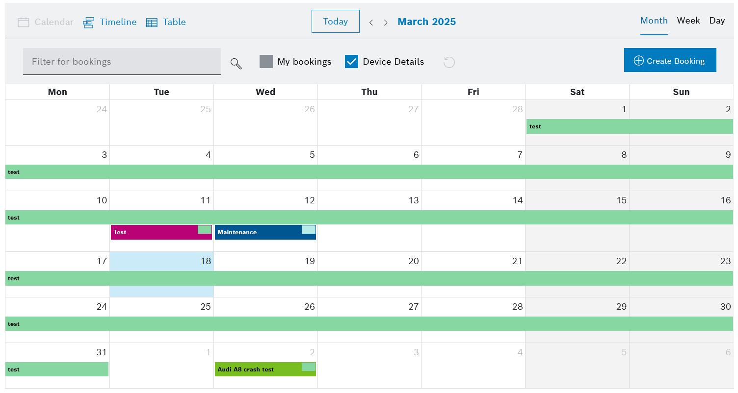
Calendar display modes
The calendar widget allows you to quickly switch between the three display modes using the buttons on the top left of the widget.
The current day on the Calendar and Timeline mode is highlighted in blue.
All three modes include a Today button which focuses the view on the current day. In addition, clicking it on the Timeline view will also move the horizontal scrollbar to the current day.
Calendar mode
Timeline mode
The resources inside the timeline calendar view are grouped by their device type with an indication of the number of devices in each group.
The groups can be expanded and collapsed. By default, they are displayed in alphabetical order. Custom order can also be applied, as described in step 6 in the Calendar Configuration.
Use the filter icon  to select which device properties shall be displayed for each device.
These device properties must be added in the Extended device details section, refer to step 5 in the Calendar Configuration.
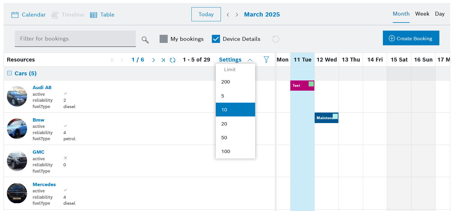
Table mode