Configuring the Table Settings
Open the Table Settings pane of the widget's configuration editor and use the dedicated tabs, namely Options, Custom Columns, and Batch Processing, to configure the table view.
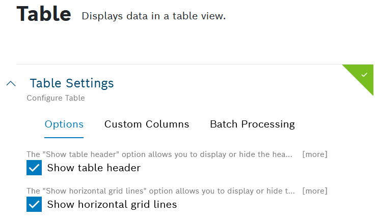
Options
In the Options tab, which opens by default:
Deactivate the Show table header checkbox to hide the table header in the widget.
If you have created query templates, the data will be taken for the table header.
Activate the Show horizontal grid lines checkbox to add grid lines after each row.
Activate the Show vertical grid lines checkbox to add grid lines after each column.
Deactivate the Add zebra-striping to any table row checkbox to display every row in the same color.
Activate the Set fixed column width checkbox to prevent the column width from adjusting when the content changes.
Activate the Show global table filter checkbox to add a search field to the table with which you can search all columns.
Activate the Show column filter checkbox to filter each column using the added filter icon.
Activate the Enable reporting checkbox to make the widget available for personal reports and the respective email notifications.
To learn how to generate personal reports based on table widget data, refer to Personal reports.
In the Entries per page field, specify the number of rows that shall be displayed per page.
The number you define will be the first entry in the Settings drop-down list above the table.
In the Table height in rows field, specify the number of rows to set the height of the table.
The number cannot be higher than the number specified in the Entries per page field.
In the Footer content field, select a footer content to add the summary or average of all numerical values for a column.
Non-numerical values will be ignored.
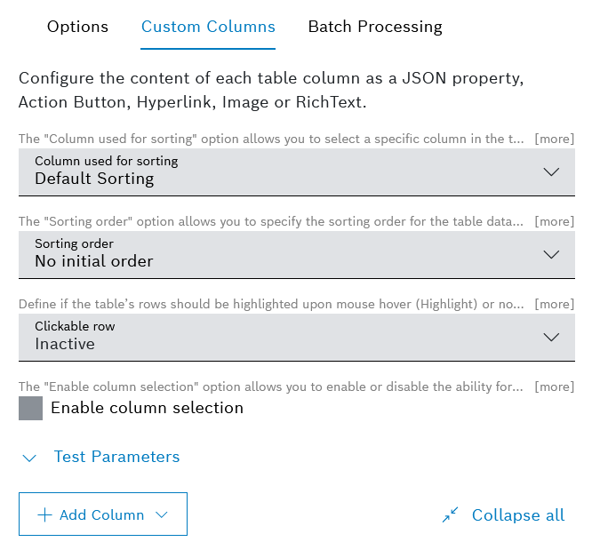
Custom Columns
In the Custom Columns tab, you can configure the content of each table column as a JSON property, an action button, a hyperlink, an image or rich text.
If no custom column configuration is provided, the table will display all available properties of the provided data object.
Proceed as follows:
In the Column used for sorting drop-down list, select the column for the initial sorting.
This field is displayed only after at least one column has been added.
In the Sorting order drop-down list, select the way the column selected above shall be sorted.
-
This field is displayed only after at least one column has been added.
In the Clickable row drop-down list, select one of the following options:
Inactive - the table rows are not highlighted when you hover the mouse over them and are not clickable
Highlight - the table rows are highlighted when you hover the mouse over them but are not clickable
Hyperlink / Action - the list also displays all defined columns which contain a hyperlink or an action button
Such columns can be made clickable, which means that when you click anywhere on a table's row, this column's action will be triggered or its hyperlink will be opened. The mouse cursor will indicate if a row is clickable.
If other columns of the table also contain action buttons or hyperlinks, these can be clicked directly in the table. Clickable rows are highlighted by default upon mouse hover.
If you have selected an action button column with multiple action buttons, the first defined action button in the column will be executed.
Activate the Enable column selection checkbox to be able to select and unselect columns of the table and thus to show and hide them in the table, respectively.
This field becomes active when you have added at least one column.
In the Test Parameters pane, enter filter parameters to test it.
This pane can be used if a filter widget is configured for the dashboard.
Independently from the test parameters, user-specific information can be referenced.
Adding, rearranging, and removing a column
To add a new column, click the Add Column button.
Admin users can add up to 50 columns. Please, be aware that when adding more than 25 columns, you may experience slower rendering of the widget, depending on the total number of columns and on the number of columns with rich text content.
From the button's dropdown options, select the column's type.
You can choose between: Action Button, Hyperlink, Image, JSON Property, and Rich Text.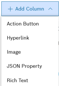
When you have added multiple columns, use the Collapse all and respectively Expand all options to navigate more easily to the respective column configuration editor.
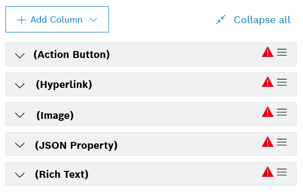
To rearrange the columns, drag and drop them to the relevant position.
To remove a column, expand it and click the
 Remove icon on the bottom.
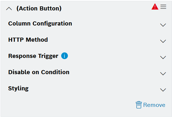
Configuring an Action Button column type
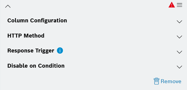
For the Action Button column type, the configuration options are grouped into the following sections:
Column Configuration,
HTTP Method,
Response Trigger,
Disable on Condition, and
Styling.
The styling section provides the same configuration options for all column types besides JSON, which has an additional option for color range definition.
Expand and collapse each section for easier navigation to the relevant configuration fields.
The sections are explained in more details below.
Column Configuration
Expand the Column Configuration section.
→ The available configuration options are displayed.
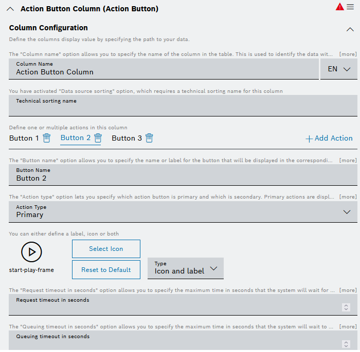
Proceed as follows:
In the Column Name field, enter a name for the column.
Click the EN drop-down list and select Add DE: German to add the German equivalent for the label.
In the Technical sorting name field, define a technical name for the column, which will be used for backend sorting. Otherwise, the backend sorting option will not function properly, even if it has been enabled for the data source.
By default, the configurator offers you to define a REST Request button. Click the
 Add Action option on the right if you need to add several buttons and/or a Hyperlink button.
Then for each button, enter a unique name in the Button Name field and repeat the steps described below.
In the Button Name field, enter text that shall be displayed on the button.
In the Action Type field, define whether the action button will be Primary (default) or Secondary. Primary actions will be displayed directly in the table, whereas secondary actions will be hidden in a context menu.
In the icon area:
Click the Select Icon button to select an icon different from the default one.
Click the Reset to Default button to reset to the default icon.
In the Type drop-down list on the right, select how the icon should be displayed:
Only icon - with this option, only the icon will be displayed on the button, whereas the label defined for the button will be displayed only as a tooltip
Only label - with this option, only the label defined for the button will be displayed, whereas the selected icon will not be displayed
Icon and label - with this option, the button will display both the icon and the defined label
For REST Request buttons:
In the Request timeout in seconds field, specify the maximum time in seconds that the system will wait for a response from the REST API before timing out.
This helps in managing the duration of the API request and handling potential delays.
In the Queuing timeout in seconds field, specify the maximum time in seconds that the system will wait to acquire a read ticket before timing out. This can be individually overridden if needed.
In the Duration in seconds field, define the caching duration in seconds, which must be at least 5 seconds. A value of 0 deactivates the cache explicitly.
This option helps in optimizing the performance by storing the API response for a specific period, and thus reducing the need for repeated API calls.
In the Tooltip text field, specify the text that will be displayed as a tooltip when hovering over the values in this column.
You can use placeholders to enrich the tooltip text with data, e.g. 'My Tooltip value ${[i].payload.value}'.
For Hyperlink buttons:
In the URL field, enter the URL of external web pages or resources.
Placeholder can be used to create dynamic links and react to your data.
In the Action field, expand the drop-down list and select whether the link shall be opened in the same tab, opened in a new tab, or copied to clipboard.
In the Tooltip text field, specify the text that will be displayed as a tooltip when hovering over the values in this column.
You can use placeholders to enrich the tooltip text with data, e.g. 'My Tooltip value ${[i].payload.value}'.
HTTP Method
Expand the HTTP Method section.
→ The available configuration options are displayed.
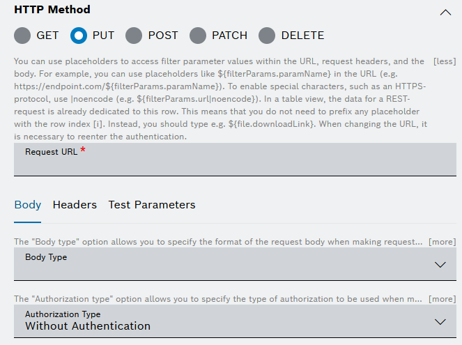
Proceed as follows:
Select the relevant HTTP Method.
In the Request URL field, enter the Request URL to the third-party system.
In the URL, you can refer to entries from the data source, with a path to the data element in the nested structure.
In the Body tab:
In the Body Type field, select the relevant body type: Raw Data, Form Data, or Document.
The Body type option allows you to specify the format of the request body when making requests to the REST API. It is not available for the GET and DELETE HTTP methods.
For Raw Data, enter the request body.
For Form Data, enter a key-value pair.
For Document, the system will send the matched document (defined in the data source) to the HTTP endpoint.
In the Authorization Type drop-down list, select the type of authorization to be used when making requests to the REST API.
The default option is Without Authentication.
For Basic Auth:
In the Username field, enter the username.
In the Password field, enter the password.
For OAuth 2.0:
In the Grant Type drop-down list, select the type of credentials.
Enter the Access Token URL.
Enter the Client ID.
Enter the Client Secret.
If you selected Password Credentials as Grant Type, also enter the Username and the Password.
For OAuth 2.0 Bearer Token, enter the token.
For Current User Session, be aware that this option only works for service domains that belong to the current project and not 3rd party applications.
In the Headers tab:
Enter a Key and a Value.
Activate the Secret Header checkbox to flag the header as secret.
When editing the REST request, the header information has to be provided.
Click the + Add Header button to add another row.
To remove a row, click the the Remove icon
.
In the Test Parameters tab, enter a filter parameter to test it.
This pane can be used if a filter widget is configured for the dashboard.
Independently from the test parameters, user-specific information can be referenced.
Response Trigger
Expand the Response Trigger section.
→ The available configuration options are displayed.
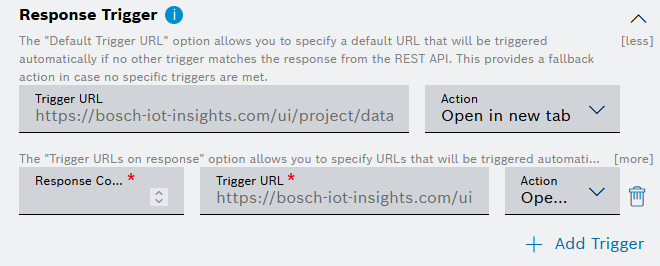
Proceed as follows:
In the Default Trigger URL field, configure a URL that will be triggered if no other trigger matches the response from the REST API.
This provides a fallback action in case no specific triggers are met.In the Action drop-down list, select whether the link shall be opened in the same tab, opened in a new tab, or copied to clipboard.
In the Response Code field, enter a response code.
In the Trigger URL field, enter a URL that will be opened automatically upon receiving the respective response code from the REST API.
This can be used to initiate additional actions or processes based on the API response.
In the Action drop-down list, select whether the link shall be opened in the same tab or in a new tab.
Тo add a trigger for another response code, click the Add Trigger button.
To configure the newly added trigger, repeat the steps from 3 to 5.
Disable on Condition
Expand the Disable on Condition section.
→ The available configuration options are displayed.
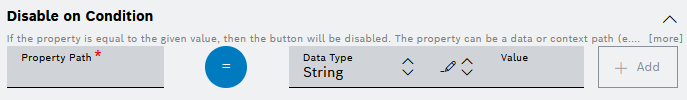
Proceed as follows:
If you need to disable the button when the configured conditions apply:
In the Property Path field, enter a property path where a condition shall be set.
The property can be a data or context path (e.g. 0.device.color or filterParams.url or inputFields.id). The value can be any string, number, date, or boolean, and can be a simple value or a reference from the input widget, filter widget, data source or user context. If it is left empty or set to undefined, then the action will be disabled if no value is found for the property.
In the operator area, click the operator icon to select from the available operator options.
From the Data Type drop down list, select a data type for the condition. You can choose between String, Number, Date, and Boolean.
From the
 Value type drop down list, choose between a simple value and a reference to the Input Widget, Filter Widget, User Context or Data Source.
In the Value input field, enter any value at which the button shall be disabled depending on the data type and value type you selected.
This field can be left empty or set to undefined to disable the button if there is no value available.
To add the condition, click the Add button.
Styling
Expand the Styling section.
→ The available configuration options are displayed.
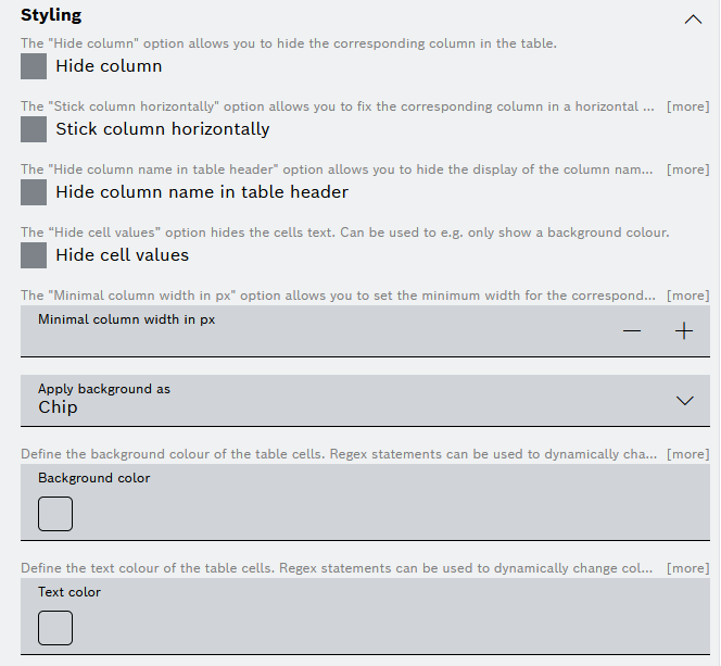
Proceed as follows:
Activate the Hide column checkbox if you need to hide the column in the table.
Even if you choose to hide this column, the Enable column selection option described earlier will still allow you to select and unselect the column and thus to show and hide it in the table, respectively.
Activate the Stick column horizontally checkbox if you need to fix the column in a horizontal position while scrolling through the table.
When the box is checked, the column will be kept in place. When the box is not checked, the column will scroll horizontally with the rest of the table.Activate the Hide column name in table header checkbox to not display the column name in the table.
Activate the Hide cell values checkbox to hide the cells text, for example to only show a background color.
In the Minimal column width in px field, you can manually set the minimal column width to avoid word breaks in the column, ensuring that the column does not become narrower than the specified value. This can help maintain readability and prevent excessive compression of the column.
From the Apply background as drop down list, select one of the following options:
Chip (default) - applies color to a chip around the value only
Cell - applies color to the entire cell
If a cell has no value, then the entire cell will be colored, regardless of the choice.
In the Background color field, click on the default color icon to configure the background color of the column.
In the drop-down list next to the Color field, select one of the following options:
Value
Click the color square to select another color or enter a color code.Data Source
Select a parameter path from the drop-down list.User Context
Select user information to be displayed, e.g., User ID, User Email, or the time zone.Filter Widget
Select a filter from the Filter widget you added to the dashboard.Input Widget
Select the input field from the Input widget you added to the dashboard.
In the Text color field, define the text color as described above for Background color.
Configuring a Hyperlink column type
For a Hyperlink column type, the configuration options are grouped into the following sections:
Column Configuration and
Styling.
The Styling options configuration is the same as described above in Configuring an Action button column type.
Column Configuration
Expand the Column Configuration section.
→ The available configuration options are displayed.
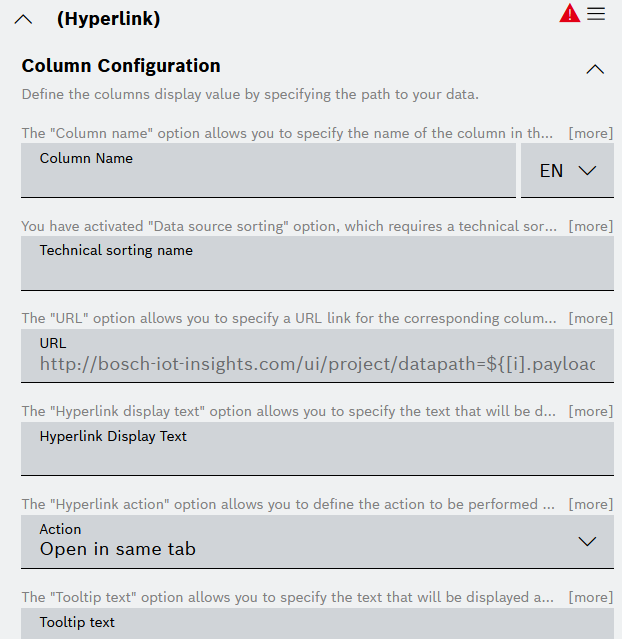
Proceed as follows:
In the Column Name field, enter a name for the column.
Click the EN drop-down list and select Add DE: German to add the German equivalent for the label.
In the Technical sorting name field, define a technical name for the column, which will be used for backend sorting. Otherwise, the backend sorting option will not function properly, even if it has been enabled for the data source.
In the URL field, enter a URL or a file link.
As opening a file link is considered a potential security risk, it is restricted by modern web clients.
Therefore, in order to open this link from the widget later on, you can copy it from the dialog which appears when the link is clicked, and then paste it into your file explorer.
Make sure that the link is trustable and correct before using it.
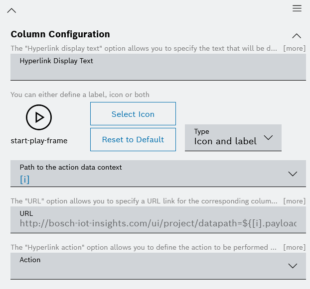
In the Hyperlink Display Text field, enter the text that shall be displayed for the hyperlink.
In the Action drop-down list, select whether the hyperlink shall be opened in the same tab, opened in a new tab, or copied to clipboard.
In the Tooltip text field, specify the text that will be displayed as a tooltip when hovering over the values in this column.
You can use placeholders to enrich the tooltip text with data, e.g. 'My Tooltip value ${[i].payload.value}'.
Configuring an Image column type
For an Image column type, the configuration options are grouped into the following sections:
Column Configuration,
Image Source, and
Styling.
The Styling options configuration is the same as described above in Configuring an Action button column type.
Column Configuration
Expand the Column Configuration section.
→ The available configuration options are displayed.
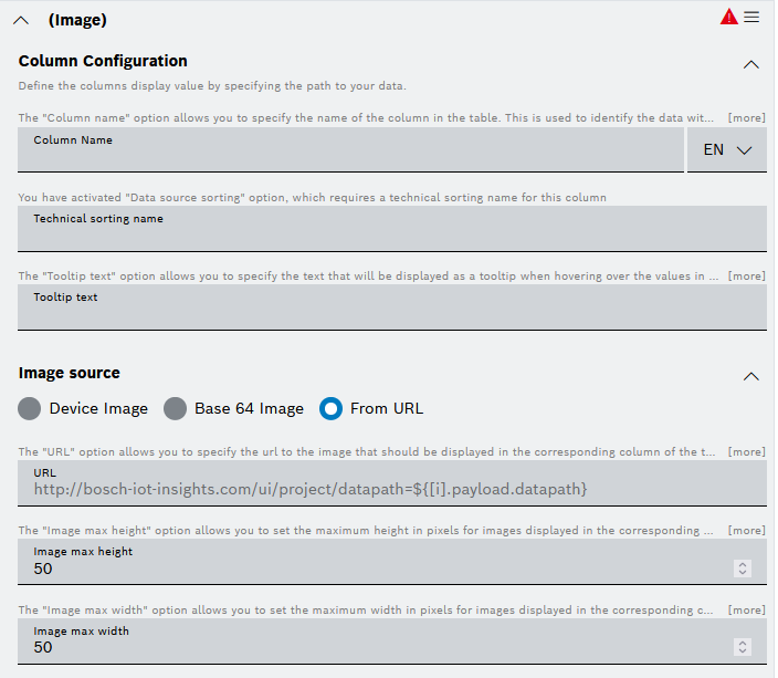
Proceed as follows:
In the Column Name field, enter a name for the column.
Click the EN drop-down list and select Add DE: German to add the German equivalent for the label.
In the Technical sorting name field, define a technical name for the column, which will be used for backend sorting. Otherwise, the backend sorting option will not function properly, even if it has been enabled for the data source.
In the Tooltip text field, specify the text that will be displayed as a tooltip when hovering over the values in this column.
You can use placeholders to enrich the tooltip text with data, e.g. 'My Tooltip value ${[i].payload.value}'.
Image Source
Expand the Image Source section (also visible on the screenshot above).
→ The available configuration options are displayed.
Proceed as follows:
For the source type, activate one of the radio buttons:
Device image
Base 64 image
From URL
For the option Device image, the Device property path field allows you to specify the path to the image within the device data that should be displayed in the corresponding column of the table.
For the option Base 64 image, the Base 64 property path field allows you to specify the path to the image base 64 within the data source that should be displayed in the corresponding column of the table.
For the option From URL, the URL field allows you to specify the url to the image that should be displayed in the corresponding column of the table.
In the fields Image max height and Image max width, enter values for the maximum image size in pixels.
Configuring a JSON Property column type
For a JSON Property column type, the configuration options are grouped into the following sections:
Column Configuration,
Data Type Handling, and
Styling.
As the styling section offers an additional option compared to the other column types, it is described separately below.
Column Configuration
Expand the Column Configuration section.
→ The available configuration options are displayed.
Proceed as follows:
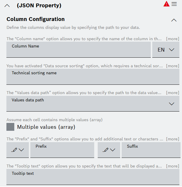
In the Column Name field, enter a name for the column.
Click the EN drop-down list and select Add DE: German to add the German equivalent for the label.
In the Technical sorting name field, define a technical name for the column, which will be used for backend sorting. Otherwise, the backend sorting option will not function properly, even if it has been enabled for the data source.
In the Values data path drop-down list, select or enter the iterator.
Select the Multiple values (array) checkbox to have all values of an array displayed in a table row.
When the Multiple values (array) checkbox is selected, the Array value separator field is displayed.
Use its drop-down list to specify how the values in that table row shall be separated from each other, e.g. Line break, Comma, Semicolon, White space, or List based.In the drop-down list next to the Prefix field, select one of the following options:
Value
Enter any value as a prefix, e.g., €.Data Source
Select a parameter path from the drop-down list.User Context
Select user information to be displayed as prefix, e.g., User ID, User Email, or the time zone.Filter Widget
Select a filter from the Filter widget you added to the dashboard.Input Widget
Select the input field from the Input widget you added to the dashboard.
In the drop-down list next to the Suffix field, select one of the following options:
Value
Enter any value as a suffix, e.g., %.Data Source
Select a parameter path from the drop-down list.User Context
Select user information to be displayed as suffix, e.g., User ID, User Email, or the time zone.Filter Widget
Select a filter from the Filter widget you added to the dashboard.Input Widget
Select the input field from the Input widget you added to the dashboard.
In the Tooltip text field, specify the text that will be displayed as a tooltip when hovering over the values in this column.
You can use placeholders to enrich the tooltip text with data, e.g. 'My Tooltip value ${[i].payload.value}'.
Data Type Handling
Expand the Data Type Handling section.
→ The available configuration options are displayed.
Proceed as follows:
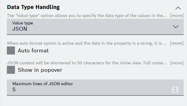
The Value Type option allows you to specify the data type of the values in the corresponding column of the table. This lets you define how the data will be displayed on the basis of its type.
In the Value Type drop-down list, select one of the available options:
Boolean,
Number,
String,
Date/Time,
JSON
Depending on the data type you selected, define the following:
For Boolean:
In the Enter text to be shown instead of "true" field, enter a value that is displayed instead of true.
In the Enter text to be shown instead of "false" field, enter a value that is displayed instead of false.
For Number:
Activate the Thousands separator checkbox to format numbers.
Select the number of Decimal Digits for behind the comma.
For String, activate the Wrap text checkbox to add line breaks.
Checking the box will wrap the text within the column, while unchecking it will display the text on a single line without wrapping.For Date/Time:
Activate the Disable time zone conversion (Date and time is shown as UTC) checkbox to use UTC.
In the Time format drop-down list, select a format in which the date and time shall be displayed.
For JSON:
Activate the Autoformat checkbox to automatically indent the formatting of the JSON.
Activate the Show in popover checkbox to activate the inline view which provides the first 50 characters of the JSON in the form of a hyperlink.
In the Maximum lines of JSON editor field, define the number of rows to be displayed before scrolling is necessary.
Styling
Expand the Styling section.
→ The available configuration options are displayed.
Proceed as follows:
Activate the Hide column checkbox if you need to hide the column in the table.
Even if you choose to hide this column, the Enable column selection option described earlier will still allow you to select and unselect the column and thus to show and hide it in the table, respectively.
Activate the Stick column horizontally checkbox if you need to fix the column in a horizontal position while scrolling through the table.
When the box is checked, the column will be kept in place. When the box is not checked, the column will scroll horizontally with the rest of the table.Activate the Hide column name in table header checkbox to not display the column name in the table.
Activate the Hide cell values checkbox to hide the cells text, for example to only show a background color.
In the Minimal column width in px field, you can manually set the minimal column width to avoid word breaks in the column, ensuring that the column does not become narrower than the specified value. This can help maintain readability and prevent excessive compression of the column.
From the Apply background as drop down list, select one of the following options:
Chip (default) - applies color to a chip around the value only
Cell - applies color to the entire cell
If a cell has no value, then the entire cell will be colored, regardless of the choice.
In the Background color field, configure the background color of the column.
You can choose between a Default color and a Conditional color by means of the square icon and the plus icon in the field, respectively.
You can define different rules based on which different colors can be displayed.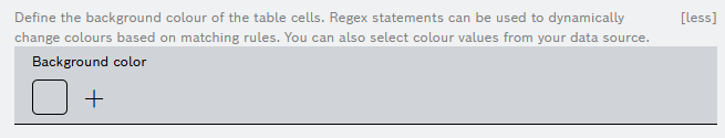
If you selected the Default color icon, the Default color dialog is displayed, where you can proceed as follows:
In the drop-down list next to the Color field, select one of the following options:
Value
Enter your color value manually by using a HEX code or use the color picker.Data Source
Select a parameter path from the drop-down list.User Context
Select user information to be displayed, e.g., User ID, User Email, or the time zone.Filter Widget
Select a filter from the Filter widget you added to the dashboard.Input Widget
Select the input field from the Input widget you added to the dashboard.
Click the Apply button.
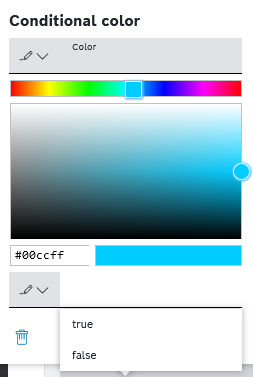
If you selected the Conditional color icon, the Conditional color dialog is displayed, where you can proceed as follows:
In the drop-down list next to the Color field, select one of the following options:
Value
Enter your color value manually by using a HEX code or use the color picker.Data Source
Select a parameter path from the drop-down list.User Context
Select user information to be displayed, e.g., User ID, User Email, or the time zone.Filter Widget
Select a filter from the Filter widget you added to the dashboard.Input Widget
Select the input field from the Input widget you added to the dashboard.
In the drop-down list next to the condition field, which depends on the value type (see below), select one of the following options:
Value
You can enter your condition manually depending on the value type, as described in point c. below.Data Source
Select a parameter path from the drop-down list referring to this condition.User Context
Select user information to be referred, e.g., User ID, User Email, or the time zone.Filter Widget
Select a filter from the Filter widget you added to the dashboard.Input Widget
Select the input field from the Input widget you added to the dashboard.
Click the condition field and fill in the condition based on which the specified color shall be displayed, as follows:
If you have selected Boolean as Value Type in Data Type Handling section, select either true or false. You can define another conditional color for the other value as well.
If you have selected Number as Value Type in Data Type Handling section, add values to the From and To fields.
If you have selected String as Value Type in Data Type Handling section, set a dynamic background color with regular expressions to have the color of the row depend on the result of the regular expressions.
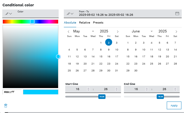
If you have selected Date/Time as Value Type in Data Type Handling section, choose between the options in the Absolute, Relative, and Presets tabs.
Confirm by clicking the Apply button.
In the Text color field, define the text color.
Follow the same steps as described for Background color above.
Configuring a Rich Text column type
For a Rich Text column type, the configuration options are grouped into the following sections:
Column Configuration,
Data Type Handling, and
Styling.
The Styling options configuration is the same as described above in Configuring an Action button column type.
Column Configuration
Expand the Column Configuration section.
→ The available configuration options are displayed.
Proceed as follows:
In the Column Name field, enter a name for the column.
Click the EN drop-down list and select Add DE: German to add the German equivalent for the label.
In the Technical sorting name field, define a technical name for the column, which will be used for backend sorting. Otherwise, the backend sorting option will not function properly, even if it has been enabled for the data source.
Enter the text to be displayed in the text box.
Format the text as desired.
Insert ${ to add references to data paths. A drop-down list with all possible references is displayed.
Data Type Handling
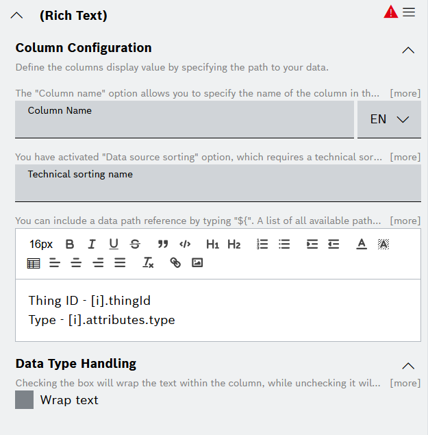
Expand the Data Type Handling section (as on the screenshot above).
Activate the Wrap text checkbox to add line breaks.
Checking the box will wrap the text within the column, while unchecking it will display the text on a single line without wrapping.
Batch Processing
In the Batch Processing tab, you can define one or several action buttons or hyperlinks which can be executed on multiple selected rows of the table with a single click.
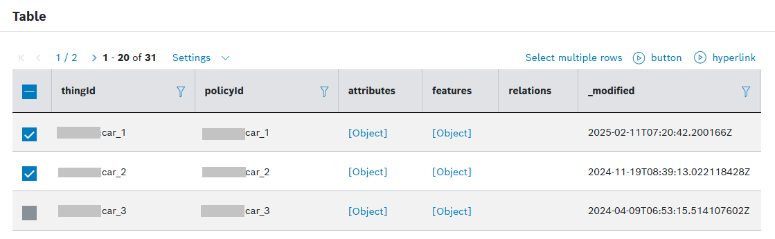
When such batch actions have been configured, they are displayed above the table on the dashboard. To execute them, you first need to select the relevant rows, and then just click the action.
See an example of configured batch actions:
To configure batch actions for your table,
Proceed as follows:
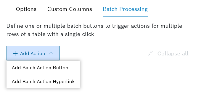
For every new button or hyperlink that you wish to add, click
Add Button in the widget configuration editor.Select the relevant type:
Add Batch Action Button
Add Batch Action Hyperlink
Fill in the configuration details described below for each batch action separately.
To navigate more easily to the relevant batch action, use the Collapse all and Expand all options.
Batch Action Button
The following configuration sections are available:
Column Configuration,
HTTP Method,
Response Trigger,
Disable on Condition.
Use the expand and collapse arrows on the right of each section to navigate to the relevant fields more easily.
Column Configuration
In the Button Name field, enter text that shall be displayed on the button.
In the icon area:
Click the Select Icon button to select an icon different from the default one.
Click the Reset to default button to reset to the default icon.
In the Type drop-down list on the right, select how the icon should be displayed:
Only icon - with this option, only the icon will be displayed on the button, whereas the label defined for the button will be displayed only as a tooltip
Only label - with this option, only the label defined for the button will be displayed, whereas the selected icon will not be displayed
Icon and label - with this option, the button will display both the icon and the defined label
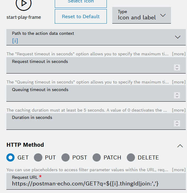
In the Path to the action data context field, define the exact path to the data element from the data source, in order to use it later in the Request URL field below.
Since the action is executed outside of the table context, the exact path to the data element needs to be defined separately. The default case is: [i].
In the Request timeout in seconds field, specify the maximum time in seconds that the system will wait for a response from the REST API before timing out.
This helps in managing the duration of the API request and handling potential delays.
In the Queuing timeout in seconds field, specify the maximum time in seconds that the system will wait to acquire a read ticket before timing out. This can be individually overridden if needed.
In the Duration in seconds field, define the caching duration in seconds, which must be at least 5 seconds. A value of 0 deactivates the cache explicitly.
This option helps in optimizing the performance by storing the API response for a specific period, and thus reducing the need for repeated API calls.
HTTP Method
Select the relevant HTTP Method.
In the Request URL field, enter the request URL to the third-party system. In the URL, you can refer to entries from the data source, with a path to the data element in the nested structure.
See the following example of a configured path and URL:
In the Body tab:
In the Body Type field, select the relevant body type: Raw Data, Form Data, or Document.
The Body type option allows you to specify the format of the request body when making requests to the REST API. It is not available for the GET and DELETE HTTP methods.
For Raw Data, enter the request body.
For Form Data, enter a key-value pair.
For Document, the system will send the matched document (defined in the data source) to the HTTP endpoint.
In the Authorization Type drop-down list, select the type of authorization to be used when making requests to the REST API.
The default option is Without Authentication.
For Basic Auth:
In the Username field, enter the username.
In the Password field, enter the password.
For OAuth 2.0
In the Grant Type drop-down list, select the type of credentials.
Enter the Access Token URL.
Enter the Client ID.
Enter the Client Secret.
If you selected Password Credentials as Grant Type, also enter the Username and the Password.
For OAuth 2.0 Bearer Token, enter the token.
For Current User Session, be aware that this option only works for service domains that belong to the current project and not 3rd Party applications.
In the Headers tab:
Enter a Key and a Value.
Activate the Secret Header checkbox to flag the header as secret.
When editing the REST request, the header information has to be provided.
Click the + Add Header button to add another row.
To remove a row, click the the Remove icon
.
In the Test Parameters tab, enter a filter parameter to test it.
This tab can be used if a filter widget is configured for the dashboard.
Independently from the test parameters, user-specific information can be referenced.
Response Trigger
In the Default Trigger URL field, configure a URL that will be triggered if no other trigger matches the response from the REST API.
In the Action drop-down list, select whether the link shall be opened in the same tab, opened in a new tab, or copied to clipboard.
In the Response Code field, enter a response code.
In the Trigger URL field, enter a URL that will be opened for the response code which you will enter in the Response Code field.
In the Action drop-down list, select whether the link shall be opened in the same tab or in a new tab.
This can be used to initiate additional actions or processes based on the API response.
Тo add a trigger for another response code, click the Add Trigger button.
To configure the newly added trigger, repeat the steps from 3 to 5.
Disable on condition
To disable the button if the configured conditions apply:
In the Property Path field, enter a property path where a condition shall be set.
The property can be a data or context path (e.g. 0.device.color or filterParams.url or inputFields.id). The value can be any string, number, date, or boolean, and can be a simple value or a reference from the input widget, filter widget, data source or user context. If it is left empty or set to undefined, then the action will be disabled if no value is found for the property.
In the operator area, click the operator icon to select from the available operator options.
From the Data Type drop down list, select a data type for the condition. You can choose between String, Number, Date, and Boolean.
From the
Value type drop down list, choose between a simple value and a reference to the Input Widget, Filter Widget, User Context or Data Source.In the Value input field, enter any value at which the button shall be disabled depending on the data type and value type you selected.
This field can be left empty or set to undefined to disable the button if there is no value available.
To add the condition, click the Add button.
Batch Action Hyperlink
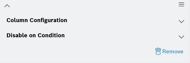
The following configuration sections are available:
Column Configuration,
Disable on Condition.
Use the expand and collapse arrows on the right of each section to navigate to the relevant fields more easily.
Column Configuration
In the Hyperlink Display Text field, enter text that will be displayed as a clickable hyperlink for the corresponding column in the table. This can provide the user with a friendly label for the hyperlink.
In the icon area:
Click the Select Icon button to select an icon different from the default one.
Click the Reset to default button to reset to the default icon.
In the Type drop-down list on the right, select how the icon should be displayed:
Only icon - with this option, only the icon will be displayed on the button, whereas the label defined for the button will be displayed only as a tooltip
Only label - with this option, only the label defined for the button will be displayed, whereas the selected icon will not be displayed
Icon and label - with this option, the button will display both the icon and the defined label
In the Path to the action data context field, define the exact path to the data element from the data source, in order to use it later in the Request URL field below.
Since the action is executed outside of the table context, the exact path to the data element needs to be defined separately. The default case is: [i].
In the URL field, enter the URL of external web pages or resources.
Within the URL, you can refer to entries from the data source, with a path to the data element in the nested structure. Placeholders can be used to create dynamic links and react to your data.
For example, placeholders like ${[i].vehicleId | join:','} would result in a comma separated list of the ids.
Here is an example URL:
https://google.com/?q=${[i].vehicleId|join:','}
In the Action field, expand the drop-down list and select whether the link shall be opened in the same tab, opened in a new tab, or copied to clipboard.
Disable on condition
To disable the button if the configured conditions apply:
In the Property Path field, enter a property path where a condition shall be set.
The property can be a data or context path (e.g. 0.device.color or filterParams.url or inputFields.id). The value can be any string, number, date, or boolean, and can be a simple value or a reference from the input widget, filter widget, data source or user context. If it is left empty or set to undefined, then the action will be disabled if no value is found for the property.
In the operator area, click the operator icon to select from the available operator options.
From the Data Type drop down list, select a data type for the condition. You can choose between String, Number, Date, and Boolean.
From the
Value type drop down list, choose between a simple value and a reference to the Input Widget, Filter Widget, User Context or Data Source.In the Value input field, enter any value at which the button shall be disabled depending on the data type and value type you selected.
This field can be left empty or set to undefined to disable the button if there is no value available.
To add the condition, click the Add button.