Table widget user guide provides details on the following topics:
Table widget view
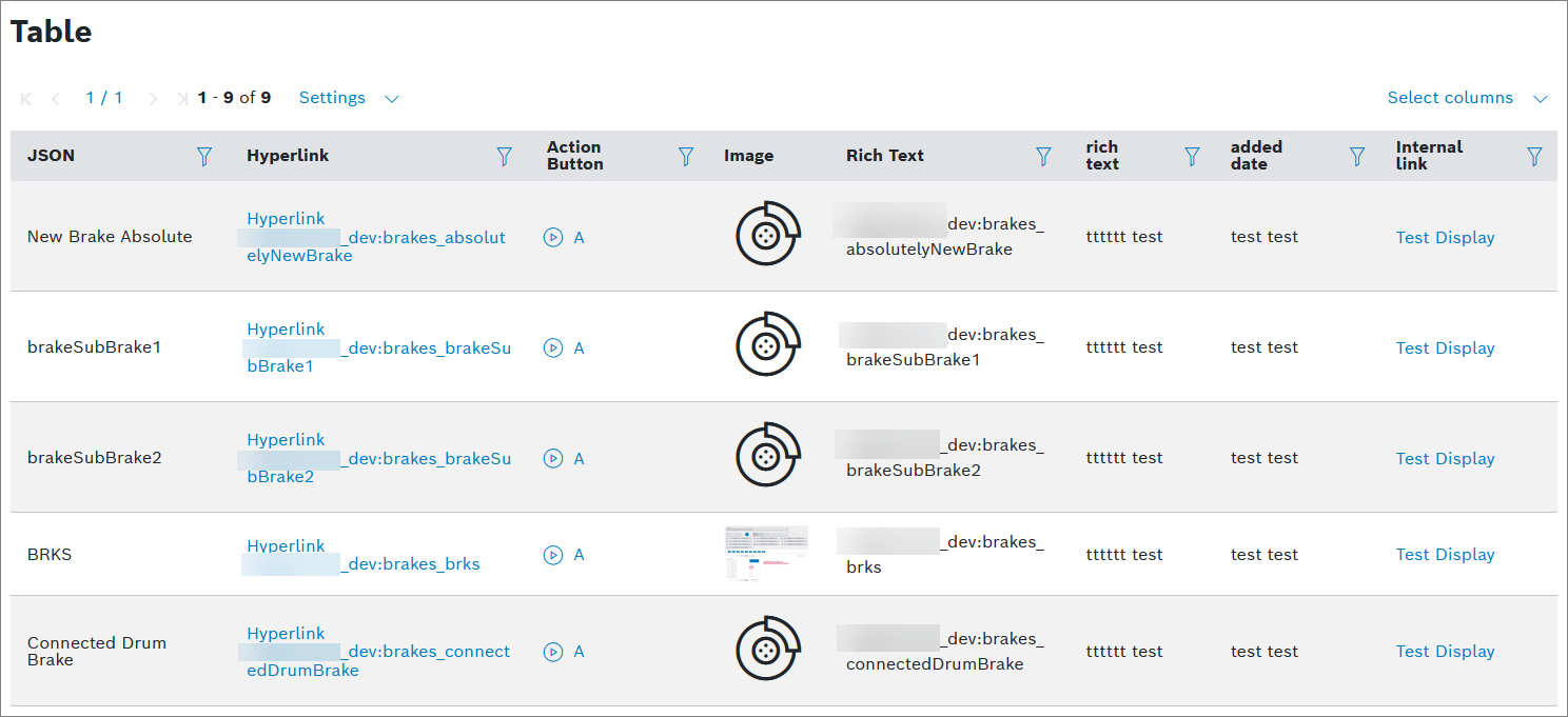
Using the Table widget, data can be displayed in a table.
Example
Proceed as follows
- On your dashboard, open the options menu and click Add widget.
- Select the Table widget in the widget list.
→ The widget configuration page is displayed.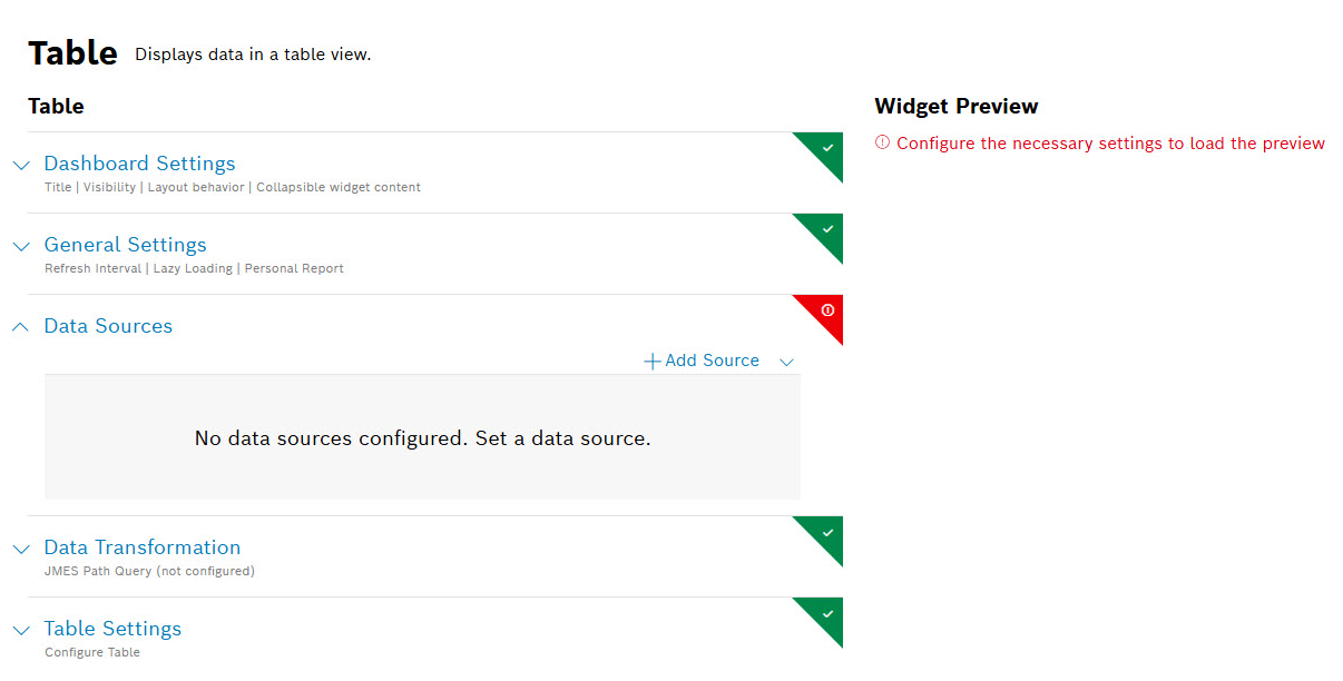
- Configure the settings as described below.
- Click the Add button.
→ The widget is added to the dashboard.
To create this widget, the following settings are mandatory to be configured:
- Data Sources
All other settings are optional.
Dashboard Settings
Open the Dashboard Settings pane to set how the widget is displayed in the dashboard: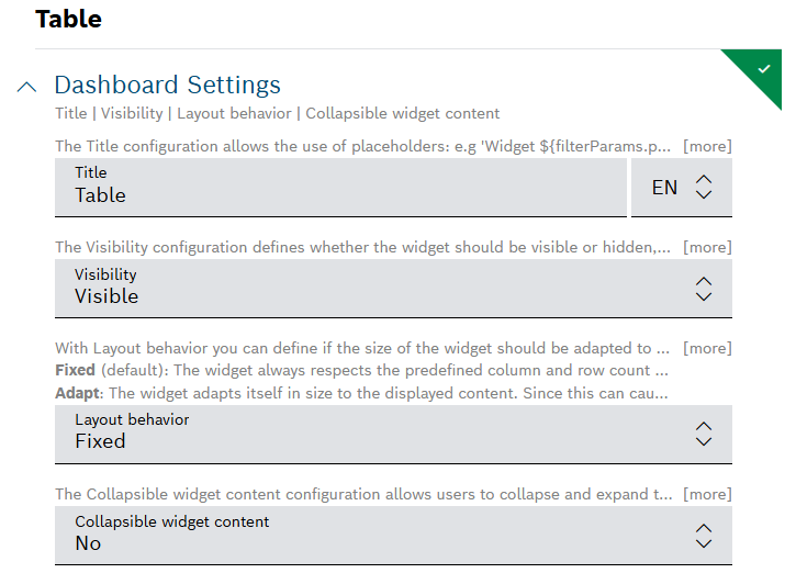
- In the Size drop-down list, decide how much space the widget should take in the form of columns.[Old layout related]
- In the Title field, enter a title for the widget.
For all fields with placeholders, autocomplete is supported.
For a dynamic title, you can add placeholders with the
${...}notation. Possible placeholder sources arefilterParams(if a filter widget exists on the dashboard, e.g.${filterParams.paramName}) or data from the data source (if source is specified, e.g.${[0].payload.value}),insights(user context),dashboardNameorwidgetId. - In the Visibility drop-down, set whether the widget should be visible or hidden. You can also define for which specific roles the widget will be shown or not. This setting allows you to customize dashboards for specific user groups that have a certain role.
Visible: The widget is visible for all (default)
Visible for roles: The widget is visible if any of the selected roles matches one of the user's project role
Hidden: The widget is hidden for all
Hidden for roles: The widget is hidden if any of the selected roles matches one of the user's project role - In the Layout behavior drop-down list, decide how the size of the widget should be adapted in the dashboard.
In the Collapsible widget content field, select one of the following options:
- Yes (collapsed on initial load): The widget will be collapsed on the initial load, however, the latest state (expanded or collapsed) will be saved in the local storage.
- Yes (expanded on initial load): The widget will be expanded on the initial load, however, the latest state (expanded or collapsed) will be saved in the local storage.
- No: The widget will not be collapsible.
The Collapsible widget content option is available only for dashboards with the grid-based layout.
If this option is enabled, the widget content can be collapsed and expanded on demand by the user to save space or hide irrelevant content based on personal interest. Keep in mind that a widget that is currently collapsed on a dashboard cannot be exported.
When the rearranging option is enabled, any collapsed widgets will be automatically expanded. On the compact layout these auto-expanded widgets will be automatically rearranged, whereas on the free-floating grid, they will remain where they are.
General Settings
Open the General Settings pane to configure some general aspects for the widget – Refresh Interval | Lazy Loading | Personal Report:
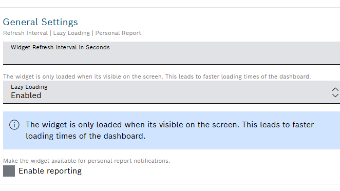
- In the Widget Refresh Interval in Seconds field, enter a value in seconds after which the widget should be refreshed.
- In the Lazy Loading drop-down list, select whether you want to enable or disable lazy loading.
Lazy loading is enabled by default. That way, widgets are only loaded when they are visible on screen. This prevents slower loading of the dashboard and performance issues.
- In the Personal report field, activate Enable reporting checkbox to make the widget available for personal report notifications.
To learn how to generate personal reports based on table widget data, refer to Personal reports.
- In the Always visible widget buttons field, select the buttons you need to have always accessible in the widget header.
Data Sources
Open the Data Sources pane to configure the data source for the widget: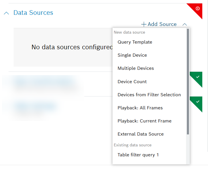
You can select a maximum of five data sources.
You can choose between a new data source and an existing data source, i.e. a data source which has already been configured on another widget on the same dashboard. The shared data source's configuration can be edited on any of the widgets that are using it, and such changes will be reflected on all respective widgets. Likewise, when one of these widgets is refreshed, the new data will be displayed on all widgets which use the same data source.
The fact that a data source is shared is indicated by a link icon next to its label. Using a shared data source will improve the dashboard's performance, ensure faster loading times and avoid redundant calls to the backend.
To avoid conflicts, every data source must have a unique label within the dashboard.
- Click the + Add Source button to add a data source.
- Select any of the following options further explained underneath:
- New data source:
- Query Template
- Single Device
- Multiple Devices
- Device Count
- Devices from Filter Selection
- Playback: All Frames
- Playback: Current Frame
- External Data Source
- Existing data source:
- The list in this group displays all shared data sources from other widgets on the dashboard
- New data source:
Query Template
Click the edit icon next to the data source label to define a unique label within the dashboard, if needed.
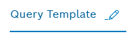
In the Query Template drop-down list, select a query template that you configured under Explore > Data Explorer, refer to Creating a query template.
A query template is a template that has been created, parameterized, and provided for others. It is similar to an SQL View and shows data in a table view.
To connect the widget with the Filter widget you created for this dashboard, click the Available references icon
 and select the Filter.
If you have a time parameter, you can choose between absolute time, relative time, and a preset by clicking the time icon
 .
.There is a Target collection parameter, if the selected query template allows multiple target collections. Select one of the allowed collections from the drop-down list, or select a dynamic reference using the Available references icon
.For Caching, add the Duration in seconds to load existing cache entries that match your parameters during that time frame.
The default cache time of 30 minutes is set automatically.
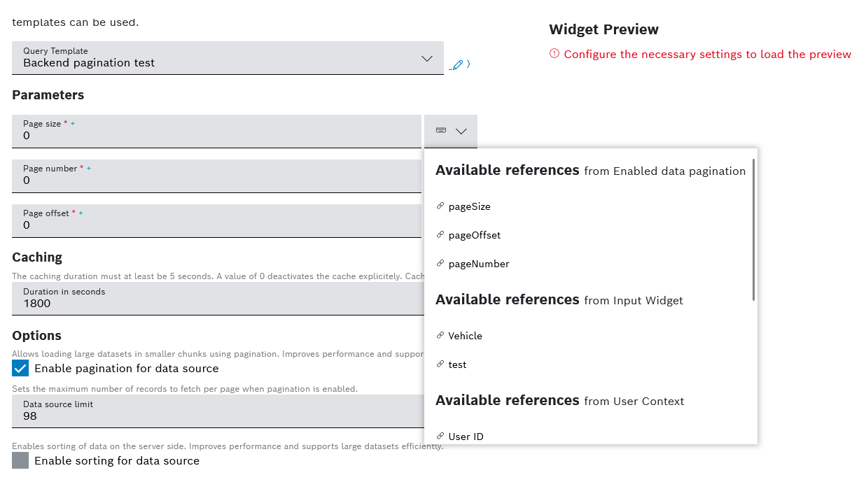
- In the Options area, check the box for Enable pagination for data source to allow the loading of large datasets in smaller chunks using backend pagination.
This improves performance and supports data sources with size limits.
- In the Data source limit field, enter a value to set the number of records to fetch per page when backend pagination is enabled.
In order for the backend pagination to function properly, within the query template that you selected as a data source you need to have defined the following parameters as integers:
pageSize, and eitherpageNumberorpageOffset. Refer to Creating a query template.When these parameters have been added in the query template and the pagination for data source option has been enabled for the widget, you need to link each parameter to its corresponding reference.
See an example of these parameters below:
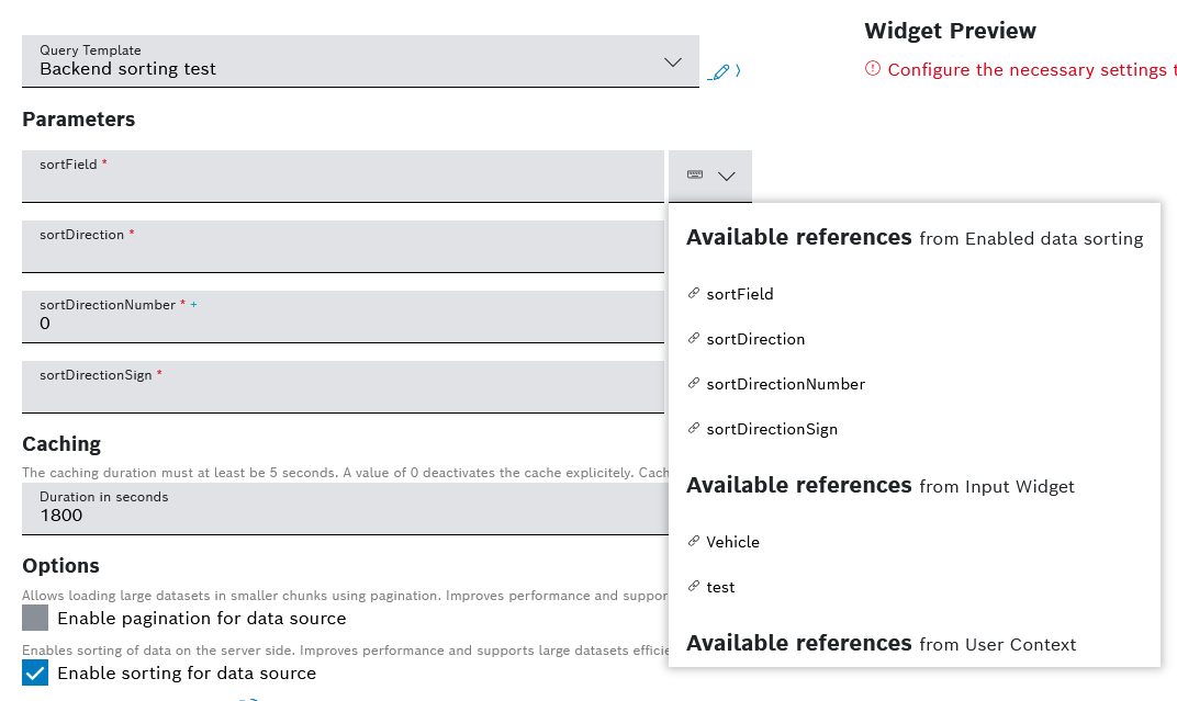
- Check the box for Enable sorting for data source to enable the sorting of data on the server side, which improves performance and supports large datasets efficiently. A backend request is sent every time when the column is clicked and sorted.
In order for the backend sorting to function properly, within the query template that you selected as a data source you need to have defined the following parameters:
sortField- defines a technical, editable sorting name of the column's data source propertysortDirection- defines the sorting direction with accepted values ofasc,desc,""sortDirectionNumber- defines the sorting direction as a number, with accepted values of1,-1,0sortDirectionSign- defines the sorting direction as a sign, with accepted values of+,-,""
Refer to Creating a query template.
When these parameters have been added in the query template and the sorting for data source option has been enabled for the widget, you need to link each parameter to its corresponding reference.
See an example of these parameters below:
In addition, if you are using custom columns in your table, you have to fill in the Technical sorting name field in the Column configuration section for the respective column which will be used for sorting. Refer to Configuring the Table Settings.
- Click the Source data preview icon
 to open a preview.
 - Click the Save Data Source button.
Single Device
Click the
 edit icon next to the data source label to define a unique label within the dashboard, if needed.
In the Default Device ID drop-down list, select a Device ID.
To connect the widget with the Filter widget you created for this dashboard, click the Available references icon
and select the Filter.- Click the Source data preview icon to open a preview.
- Click the Update Source button.
Multiple Devices
- Click the edit icon next to the data source label to define a unique label within the dashboard, if needed.
- In the Select Device Types drop-down list, select a device type.
- Click the Advanced Settings button to narrow down the output.
In the Start field, enter a value to specify the device to start with.
Example: If you select 3, the first two devices are skipped.
In the Limit field, enter a value to specify the last device.
The maximum is 200 devices.
- In the Fields field, enter the fields whose information shall be retrieved from Device Management.
- In the Sort field, enter a field configured in Device Management according to which the data shall be sorted.
- In the Namespaces field, add namespaces separated by a comma.
In the Filter field, add a filter to narrow down the search results. Placeholders are also supported.
- Click the Source data preview icon to open a preview.
- Click the Update Source button.
Device Count
The Device Count data source is based on the counting functionality in Device Management and is used to count things.
- Click the edit icon next to the data source label to define a unique label within the dashboard, if needed.
- In the Select Device Type drop-down list, select the device types/devices to be used as data source.
- All Devices: Counts all devices regardless of the fact that they have a device type or not
- All Device Types: Counts the devices that have the thing attribute type which means that the device belongs to a device type
- Without Device Type: Counts the devices without the thing attribute type
- Device Type xy: Counts the devices of the selected device types
- Click the Advanced Settings button to narrow down the output.
- In the Namespaces field, add namespaces separated by a comma.
In the DefaultFilter field, add a filter to narrow down the search results.
To connect the widget with the Filter widget you created for this dashboard, click the Available references icon
and select the Filter.- Click the Source data preview icon to open a preview.
- Click the Update Source button.
Devices from Filter Selection
Devices will be loaded that match the Device filter type configured in the Filter widget.
- Click the edit icon next to the data source label to define a unique label within the dashboard, if needed.
- In the Pagination Limit field, enter a limit of devices that shall be displayed per page.
- In the Sort field, enter a property according to which the devices shall be sorted.
- Click the Source data preview icon to open a preview.
- Click the Update Source button.
Playback: All Frames
The Playback widget must have been configured for your dashboard.
- Select Playback: All Frames to display all data that has been recorded.
Playback: Current Frame
The Playback widget must have been configured for your dashboard.
- Select Playback: Current Frame to display the data that is just being recorded.
External Data Source
Using the external data source, an external endpoint can be specified to reference data.
- Click the edit icon next to the data source label to define a unique label within the dashboard, if needed.
- Select an HTTP method.
- In the Request URL field, enter the URL of the request.
- In the Type drop-down list, select the type of authorization.
- Click the Set Configuration button to set up the selected authorization.
- For Basic Auth:
- In the Username field, enter the username.
- In the Password field, enter the password.
- For OAuth 2.0
- In the Grant Type drop-down list, select the type of credentials.
- Enter the Access Token URL.
- Enter the Client ID.
- Enter the Client Secret.
- If you selected Password Credentials as Grant Type, also enter the Username and the Password.
- For OAuth 2.0 (On-behalf grant type)
- In the Grant Type drop-down list, select Azure AD On-Behalf.
- Configure the scopes of your application API as described in External data source: on-behalf-of (OBO) flow.
- For Basic Auth:
- If you selected the GET HTTP method:
- In the Headers pane, enter a key and a value to specify the header information of the external system.
Activate the Secret Header checkbox to flag the header as secret.
When editing the data source, the header information has to be provided.
- If you selected the PUT HTTP method:
- In the Body pane, select the type of data in the Type drop-down list.
Activate the Secret Header checkbox to flag the header as secret.
When editing the data source, the header information has to be provided.
- If you selected the POST HTTP method:
- In the Body pane, select the type of data in the Type drop-down list.
Activate the Secret Header checkbox to flag the header as secret.
When editing the data source, the header information has to be provided.
- In the Duration in seconds field under Caching, specify the caching duration in seconds.
- In the Options area:
- Check the box Return full response object so that the data source emits not only the body, but the
status,statusText, and theheaders, too:|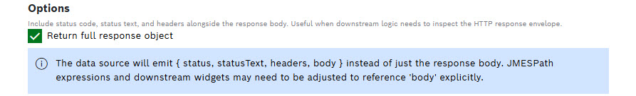
When the option is disabled, the data source emits only the body of the response.
- Check the box Enable pagination for data source, to allow the loading of large datasets in smaller chunks using backend pagination.
This improves performance and supports data sources with size limits.
- In the Data source limit field, enter a value to set the number of records to fetch per page when pagination is enabled.
- Check the box Enable sorting for data source to enable sorting on the server side.
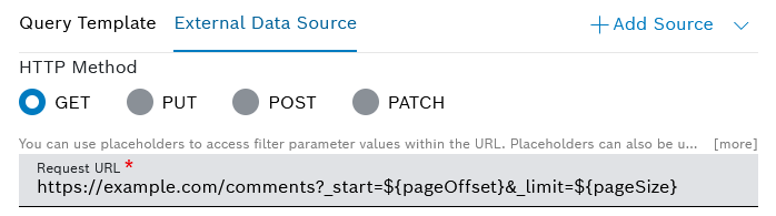
In order for the backend pagination to function properly, you need to include the following placeholders in the Request URL field which was described above:
pageSize, and eitherpageNumberorpageOffset,orpageIndex.The
pageSizeparameter corresponds to the data source limit value. ThepageNumberandpageOffsetparameters are used interchangeably, as one is automatically calculated on the basis of the other.The
pageOffsetparameter defines the number of results to be skipped. ThepageIndexparameter is always one number lower than thepageNumber.Depending on your endpoint pagination, you can either usepageIndexorpageNumber.Hint: If you use Bosch IoT Insights endpoints, it is preferable to use
pageIndexparameter instead ofpageNumber, as the respective endpoints use a Zero-based counter.Refer to the example request URL with included placeholders below:
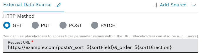
In order for the backend sorting to function properly, you need to include the following placeholders in the Request URL field which was described above:
sortField- defines a technical, editable sorting name of the column's data source propertysortDirection- defines the sorting direction with accepted values ofasc,desc,""sortDirectionNumber- defines the sorting direction as a number, with accepted values of1,-1,0sortDirectionSign- defines the sorting direction as a sign, with accepted values of+,-,""
See an example request URL with included placeholders below:
You also have to define a Technical sorting name for each custom column that will be sorted in this way. This is described in Configuring the Table Settings.
- Check the box Return full response object so that the data source emits not only the body, but the
- Click the Source data preview icon to open a preview.
- Click the Save Data Source button.
Data Transformation
With the data transformation activated, you can select entries from arrays in arrays or a specific range of arrays. You can also use the placeholders like insights, filterParams, and inputFields, which JMES Path Query supports.
Also refer to the JMESPath documentation.
Open the Data Transformation pane to activate the data transformation to JMES.
- Activate the toggle switch.
- In the Filter field, add a string to filter the data, e.g. [0] to display only the first item or
[?contains(thingId,'yourThingName')]to filter by contains in thethingIdproperty. - Click the Transformed data preview icon
 to open a preview.
→ The data transformation is activated for the widget.
If you selected more than one data source, the Data Aggregator pane is displayed.
- Activate the toggle switch.
- In the Data Aggregator drop-down list, select an aggregation method with which each entry of the same index is merged into one result.
- Activate the Merge Properties checkbox to merge the properties of the index.
- In the Filter field, add a string to filter the data, e.g. [0] to display only the first item or
[?contains(thingId,'yourThingName')]to filter by contains in thethingIdproperty. - Click the Transformed data preview icon to open a preview.
→ The data transformation is activated for the widget.
Table Settings
Open the Table Settings pane and use the dedicated tabs, namely Options, Custom Columns, and Batch Processing, to configure the table view.
Proceed as described in Configuring the table settings.