Device Details Widget
Using the Device Details widget, devices and their device information can be displayed in a widget. The information blocks you configured in Managing information blocks will be available for you to add.
Example
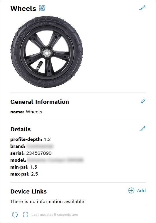
Click the QR code icon to create a QR code containing the device ID, refer to Creating a QR code.
Proceed as follows
Select the Device Details widget in the widget list.
→ The widget configuration page is displayed.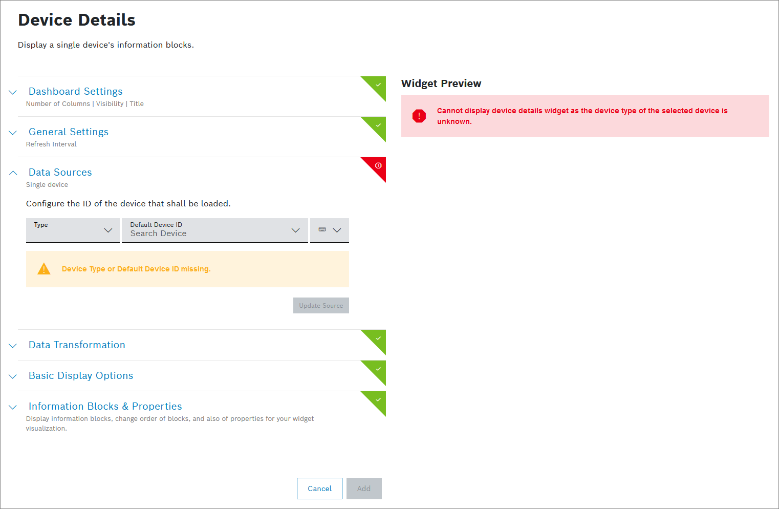
Configure the settings as described below.
Click the Add button.
→ The widget is added to the dashboard.
To create this widget, the following settings are mandatory to be configured:
Data Source
All other settings are optional.
Dashboard Settings
Open the Dashboard Settings pane to set how the widget is displayed in the dashboard.
In the Size drop-down list, decide how much space the widget should take in the form of columns.
In the Title field, enter a title for the widget.
For a dynamic title, you can add placeholders with the ${...} notation. Possible placeholder sources are filterParams (if a filter widget exists on the dashboard, e.g. ${filterParams.paramName}) or data from the data source (if source is specified, e.g. ${[0].payload.value}), insights (user context), dashboardName or widgetId.
In the Visibility drop-down, set whether the widget should be visible or hidden. You can also define for which specific roles the widget will be shown or not. This setting allows you to customize dashboards for specific user groups that have a certain role.
Visible: The widget is visible for all (default)
Visible for roles: The widget is visible if any of the selected roles matches one of the user's project role
Hidden: The widget is hidden for all
Hidden for roles: The widget is hidden if any of the selected roles matches one of the user's project roleIn the Layout behavior drop-down list, decide how the size of the widget should be adapted in the dashboard.
In the Collapsible widget content field, select one of the following options:
Yes (collapsed on initial load): The widget will be collapsed on the initial load, however, the latest state (expanded or collapsed) will be saved in the local storage.
Yes (expanded on initial load): The widget will be expanded on the initial load, however, the latest state (expanded or collapsed) will be saved in the local storage.
No: The widget will not be collapsible.
The Collapsible widget content option is available only for dashboards with the grid-based layout.
If this option is enabled, the widget content can be collapsed and expanded on demand by the user to save space or hide irrelevant content based on personal interest. Keep in mind that a widget that is currently collapsed on a dashboard cannot be exported.
When the rearranging option is enabled, any collapsed widgets will be automatically expanded. On the compact layout these auto-expanded widgets will be automatically rearranged, whereas on the free-floating grid, they will remain where they are.
General Settings
Open the General Settings pane to configure some general aspects for the widget.
In the Widget Refresh Interval in Seconds field, enter a value in seconds after which the widget should be refreshed.
In the Lazy Loading drop-down list, select whether you want to enable or disable lazy loading.
Lazy loading is enabled by default. That way, widgets are only loaded when they are visible on screen. This prevents slower loading of the dashboard and performance issues.
Data Sources
You can only add a single device.
Open the Data Sources pane to configure the data source for the widget.
In the Type drop-down list, select a device type.
In the Default Device ID field, select a device from the drop-down list or enter the device name.
Click the Update Source button to display the widget preview.
Data Transformation
With the data transformation activated, you can select entries from arrays in arrays or a specific range of arrays.
Also refer to the JMESPath documentation.
Open the Data Transformation pane to activate the data transformation to JMES.
Activate the toggle switch.
In the Filter field, add a string to filter the data, e.g. [0] to display only the first item or [?contains(thingId,'yourThingName')] to filter by contains in the thingId property.
Click the Transformed data preview icon
 to open a preview.
→ The data transformation is activated for the widget.
If you selected more than one data source, the Data Aggregator pane is displayed.
Activate the toggle switch.
In the Data Aggregator drop-down list, select an aggregation method with which each entry of the same index is merged into one result.
Activate the Merge Properties checkbox to merge the properties of the index.
In the Filter field, add a string to filter the data, e.g. [0] to display only the first item or [?contains(thingId,'yourThingName')] to filter by contains in the thingId property.
Click the Transformed data preview icon
to open a preview.
→ The data transformation is activated for the widget.
Basic Display Options
Open the Basic Display Options pane to configure the displayed elements in the widget.
De-/activate the Device title checkbox to hide or display the device name in the title.
De-/activate the Primary image checkbox to hide or display the image in the title.
Deactivate this option if you want to display the image stored in the Images information block.
Use the edit icon
 next to the display image to quickly replace the image. You can also backdate this change.
Images are displayed as thumbnail images. These smaller images allow faster dashboard loading times. Click the image to see it enlarged.
De-/activate the QR Code checkbox to hide or display a QR code that provides more information to the device.
Information Blocks & Properties
Open the Information Blocks & Properties pane to configure which information blocks will be displayed in the widget.
Activate the checkboxes of the information blocks that shall be displayed in the widget.
Use the move icon
 to change the order of the information blocks.